#SaaS
#web
Dynamic Report
Dynamic Report
Dynamic Report
Dynamic Report
Dynamic Report
Dynamic Report
Merchants can adjust script immediately based on data monitoring in order to enhance sales performance.
Merchants can adjust script immediately based on data monitoring in order to enhance sales performance.
Merchants can adjust script immediately based on data monitoring in order to enhance sales performance.
Merchants can adjust script immediately based on data monitoring in order to enhance sales performance.
Merchants can adjust script immediately based on data monitoring in order to enhance sales performance.
Merchants can adjust script immediately based on data monitoring in order to enhance sales performance.
2022年10月~2023年2月
Timeline
Sr. UX Designer
Role
2022年10月~2023年2月
Timeline
Sr. UX Designer
Role
Background
Background

17LIVE is the parent company of HandsUP, serving as the primary live streaming platform. HandsUP is a live commerce platform providing SaaS services for businesses to swiftly establish e-commerce websites and live streaming for sales. Launched in Taiwan, it expanded to Japan in 2020.
17LIVE is the parent company of HandsUP, serving as the primary live streaming platform. HandsUP is a live commerce platform providing SaaS services for businesses to swiftly establish e-commerce websites and live streaming for sales. Launched in Taiwan, it expanded to Japan in 2020.
What is the Dynamic Report?
What is the Dynamic Report?
Dynamic Report is the product feature that provides to our users for viewing live live streaming performance, aiming to assist users in optimizing and reviewing the script for the next live streaming event.
Dynamic Report is the product feature that provides to our users for viewing live live streaming performance, aiming to assist users in optimizing and reviewing the script for the next live streaming event.
1
Streamer or other marketing team members
Monitored the process, dynamic report
1
Streamer or other marketing team members
Monitored the process, dynamic report
1
Streamer or other marketing team members
Monitored the process, dynamic report
2
Streamer
Presented the Highlight Items while facing the camera or mobile phone
2
Streamer
Presented the Highlight Items while facing the camera or mobile phone
2
Streamer
Presented the Highlight Items while facing the camera or mobile phone
Version History
Version History
Beta
Beta
Users often mistakenly tap the main tab button on the header's right side, expecting to return to the previous page, but instead, they land on the list page instead of the live monitoring screen.
Users often mistakenly tap the main tab button on the header's right side, expecting to return to the previous page, but instead, they land on the list page instead of the live monitoring screen.
V1.0
V1.0
With just one sprint, I initiated optimization efforts by swiftly restructuring the data hierarchy, streamlining the top navigation bar, and implementing tab switching for improved visual clarity, facilitating user navigation.
With just one sprint, I initiated optimization efforts by swiftly restructuring the data hierarchy, streamlining the top navigation bar, and implementing tab switching for improved visual clarity, facilitating user navigation.
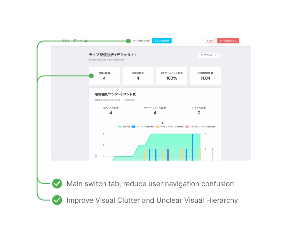
V2.0
V2.0
This version will introduce new paid feature, with the main challenge being to deliver data insights in real-time.
This version will introduce new paid feature, with the main challenge being to deliver data insights in real-time.
Goals
Goals
1
Paid Feature
Increase users of free trials of paid features.
1
Paid Feature
Increase users of free trials of paid features.
1
Paid Feature
Increase users of free trials of paid features.
2
Optimize Experience
Reduce User Frustration
2
Optimize Experience
Reduce User Frustration
2
Optimize Experience
Reduce User Frustration
Discovery
Prior to project initiation, I conducted stakeholders' interviews to gather user scenarios and insights into the fundamental requirements for dynamic report.
User Goals

Streamer
Streamer
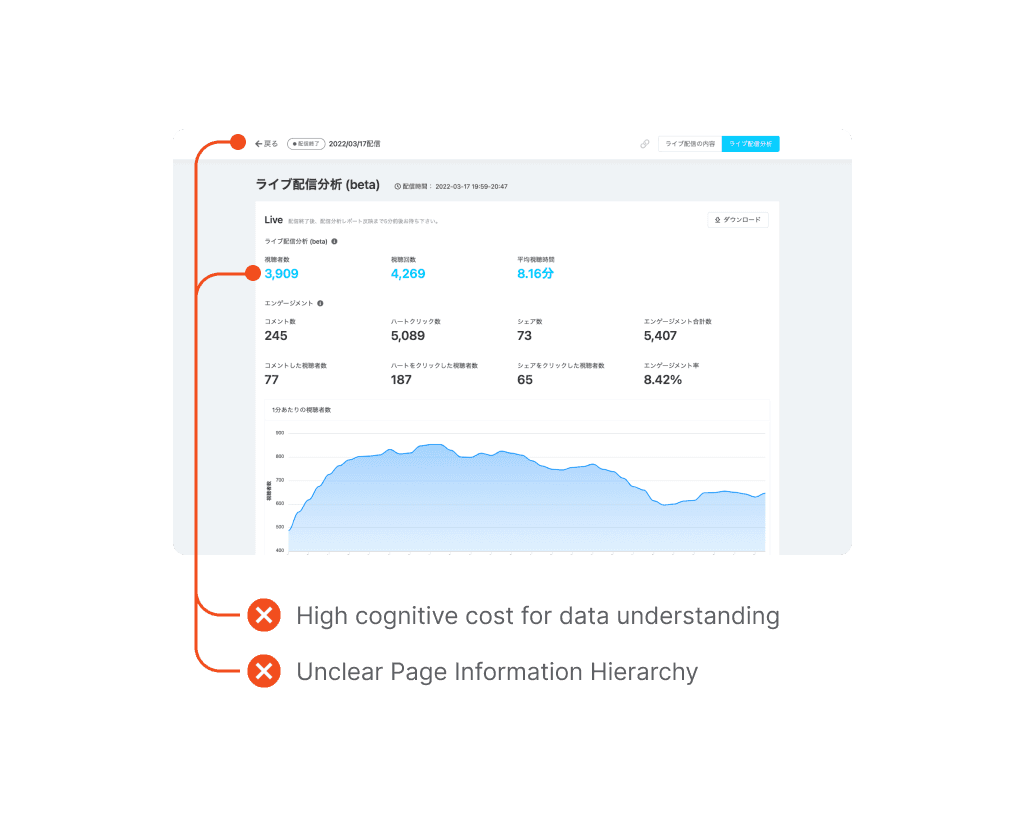
The current dashboard is not intuitive for real-time actions, requiring continuous scrolling and failing to provide effective assistance during the live stream.
The current dashboard is not intuitive for real-time actions, requiring continuous scrolling and failing to provide effective assistance during the live stream.

Marketing Planner
Marketing Planner
Many sellers have expressed that the current data dashboard makes them can not to observe product sales, and audience type as it primarily reflects interactions during live streaming.
Many sellers have expressed that the current data dashboard makes them can not to observe product sales, and audience type as it primarily reflects interactions during live streaming.
Define & Ideation
Define & Ideation
Through the interview, we have defined 1 major frustration of current design and 1 core user needs for our new version dynamic report.
Through the interview, we have defined 1 major frustration of current design and 1 core user needs for our new version dynamic report.
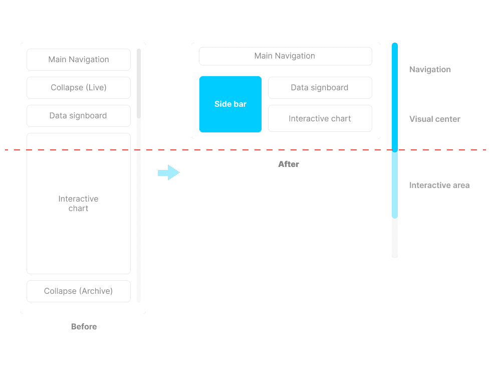
Major frustration of current design 🥲
Major frustration of current design 🥲
It’s not intuitive for real-time actions, requiring continuous scrolling and failing to provide effective assistance during the live stream.
It’s not intuitive for real-time actions, requiring continuous scrolling and failing to provide effective assistance during the live stream.

Ideation ✨
Ideation ✨
We aid users in quickly finding targets and efficiently distributing traffic on this page by ensuring charts are within a readable width range. Furthermore, we introduce a Side Menu for users to seamlessly switch between charts without scrolling.
We aid users in quickly finding targets and efficiently distributing traffic on this page by ensuring charts are within a readable width range. Furthermore, we introduce a Side Menu for users to seamlessly switch between charts without scrolling.

Core User Needs 🥹
Core User Needs 🥹
Users can not to observe product sales, and audience type as it primarily reflects interactions during live streaming. Currently, the basic data content as below:
Users can not to observe product sales, and audience type as it primarily reflects interactions during live streaming. Currently, the basic data content as below:
Total number of viewers
Total number of viewers
Total views
Total views
Total interactions
Total interactions
Average viewing time
Average viewing time
Ideation ✨
Ideation ✨
What data is necessary for sales?
What data is necessary for sales?
Viewers type
Viewers type
Add to cart
Add to cart
Here is the initial design based on the data requirements
Here is the initial design based on the data requirements
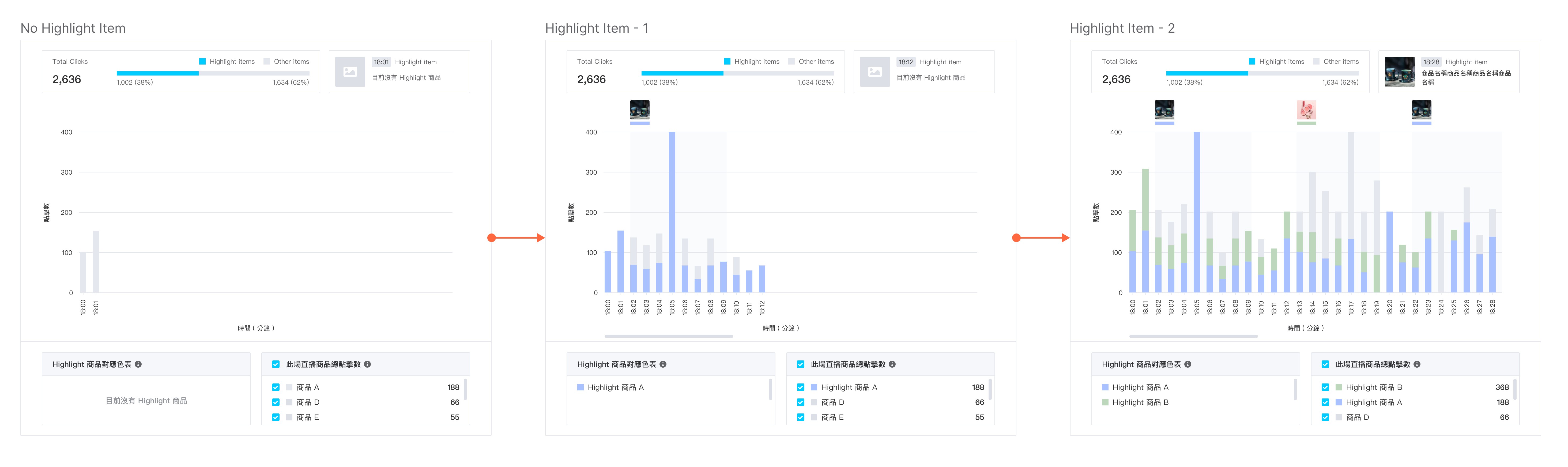
1
Poor readability
During the time when the host is presenting Highlight items, the names are often too long to display fully, leading to poor readability.
1
Poor readability
During the time when the host is presenting Highlight items, the names are often too long to display fully, leading to poor readability.
1
Poor readability
During the time when the host is presenting Highlight items, the names are often too long to display fully, leading to poor readability.
2
Without clear trend
Users cannot easily discern the current trend of growth in numbers at a glance, as there are too many line charts present simultaneously.
2
Without clear trend
Users cannot easily discern the current trend of growth in numbers at a glance, as there are too many line charts present simultaneously.
2
Without clear trend
Users cannot easily discern the current trend of growth in numbers at a glance, as there are too many line charts present simultaneously.
3
Too many action items
During live streaming, adhering to the "provide focus" principle in UX becomes crucial, as it's challenging for the host to handle complex controls, requiring the streamlining or selective presentation of options to prevent overwhelming users with excessive choices.
3
Too many action items
During live streaming, adhering to the "provide focus" principle in UX becomes crucial, as it's challenging for the host to handle complex controls, requiring the streamlining or selective presentation of options to prevent overwhelming users with excessive choices.
3
Too many action items
During live streaming, adhering to the "provide focus" principle in UX becomes crucial, as it's challenging for the host to handle complex controls, requiring the streamlining or selective presentation of options to prevent overwhelming users with excessive choices.
Adjustment
Adjustment
Adjusted…
Adjustment
Changes after discussion and internal testing feedbacks
Changes after discussion and internal testing feedbacks
Changes after discussion
Changes after discussion and internal testing feedbacks
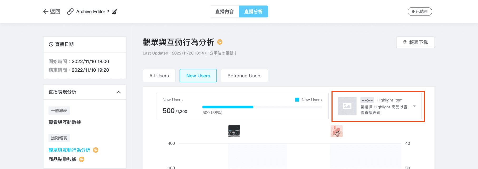
1
Highlight Items' image
When presenting Highlight items, using images instead of product names enhances readability, addressing the issue of lengthy names hindering complete display.
1
Highlight Items' image
When presenting Highlight items, using images instead of product names enhances readability, addressing the issue of lengthy names hindering complete display.
1
Highlight Items' image
When presenting Highlight items, using images instead of product names enhances readability, addressing the issue of lengthy names hindering complete display.
2
Clear data visualization
Using clear proportional bar chart combinations for the same item improves user experience, facilitating easier data understanding and comparison, and enabling quicker trend identification and decision-making.
2
Clear data visualization
Using clear proportional bar chart combinations for the same item improves user experience, facilitating easier data understanding and comparison, and enabling quicker trend identification and decision-making.
2
Clear data visualization
Using clear proportional bar chart combinations for the same item improves user experience, facilitating easier data understanding and comparison, and enabling quicker trend identification and decision-making.
3
Classify buttons by information level
For optimal UX, simplify the interface to show only relevant information and options, avoiding overwhelming users. Prioritize key user needs, like audience demographics, with a top-level tab button for direct chart filtering.
3
Classify buttons by information level
For optimal UX, simplify the interface to show only relevant information and options, avoiding overwhelming users. Prioritize key user needs, like audience demographics, with a top-level tab button for direct chart filtering.
3
Classify buttons by information level
For optimal UX, simplify the interface to show only relevant information and options, avoiding overwhelming users. Prioritize key user needs, like audience demographics, with a top-level tab button for direct chart filtering.
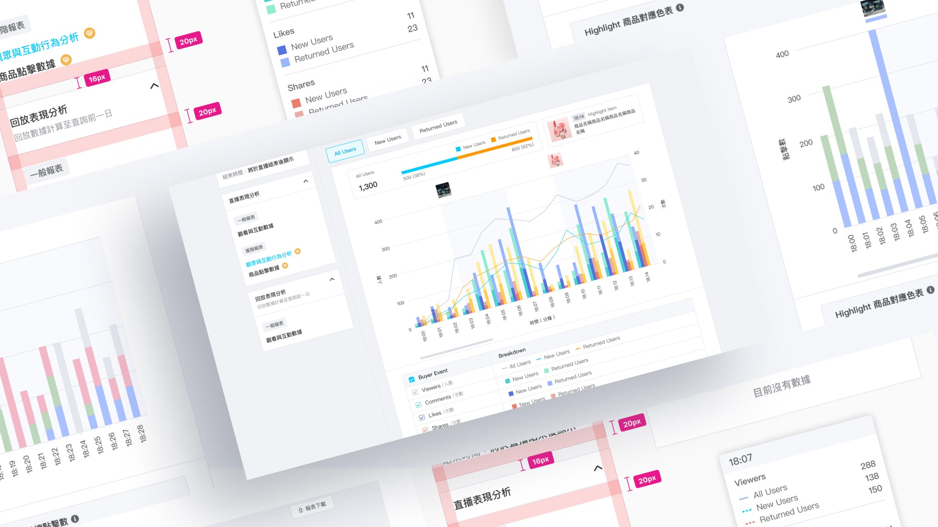
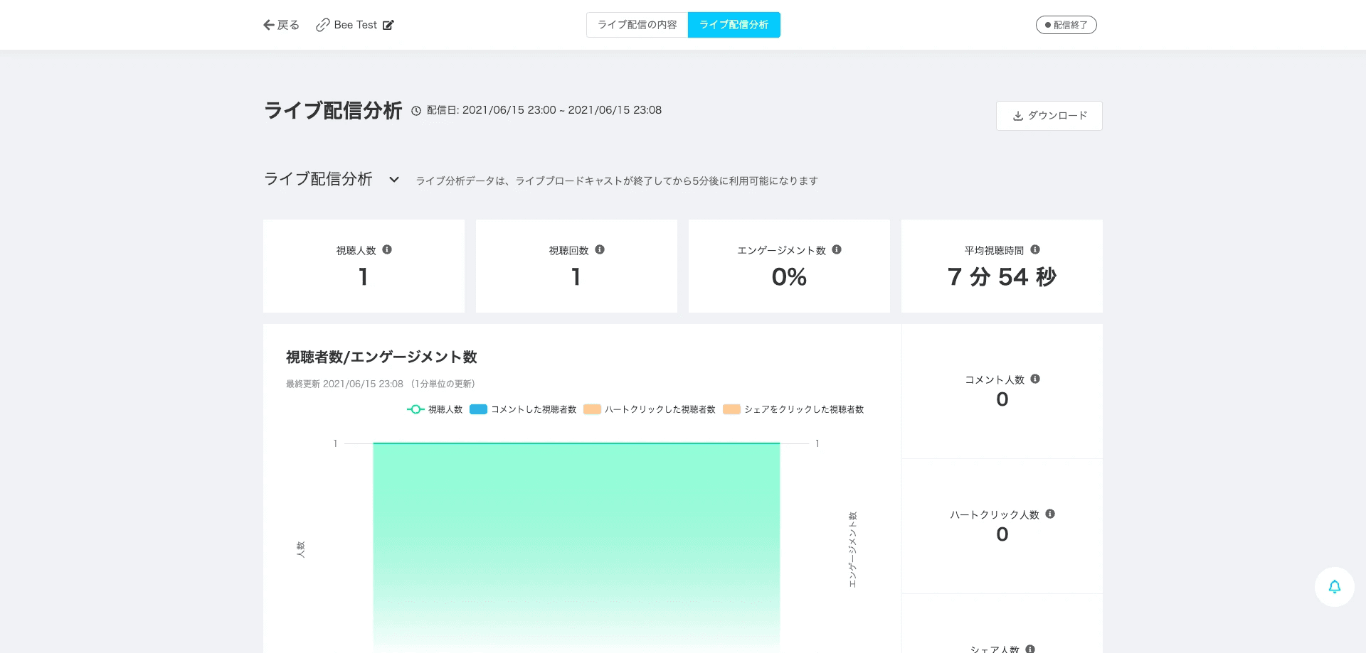
The MVP
The MVP
After scoping out the features we would like to deliver for the first launch, and started working on the visual design and address the interaction detail. There are 2 dynamic reports available as paid features.
After scoping out the features we would like to deliver for the first launch, and started working on the visual design and address the interaction detail. There are 2 dynamic reports available as paid features.
1
Event & User Engagement
Monitored the process, dynamic report
1
Event & User Engagement
Monitored the process, dynamic report
1
Event & User Engagement
Monitored the process, dynamic report
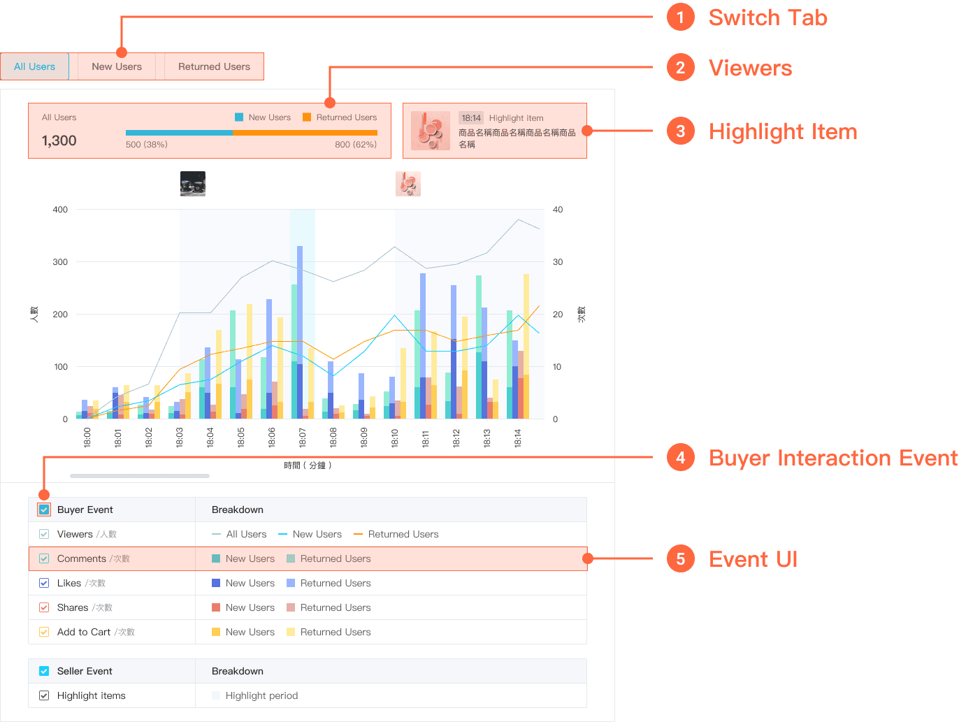
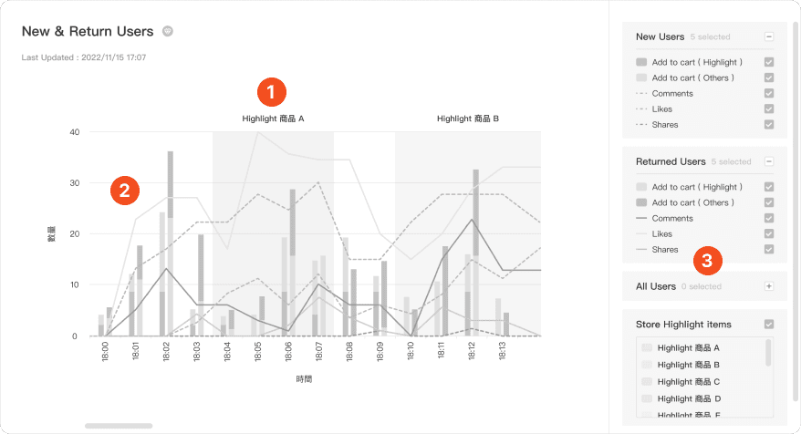
2
Add to cart & Highlight Items
After discussing the UI design with frontend engineers, we've decided to implement HSL colors for our real-time bar charts to both prevent visual fatigue and ensure a sufficient variety of colors. The H component will be divided into 100 hues, with a hue step set at 29, following the sequence: hsl(X, 70%, 80%) ➡️ hsl(X, 60%, 70%) ➡️ hsl(X, 60%, 80%) ➡️ hsl(X, 70%, 70%) ➡️ hsl(X, 80%, 80%).
Testing
Testing
By adopting usability testing, I wanted to use this MVP to see how people would interact with it and gather more feedback to help us keep iterating on it.
By adopting usability testing, I wanted to use this MVP to see how people would interact with it and gather more feedback to help us keep iterating on it.
Test Overview
Test Overview
✦ Duration : Jan 19 – 29, 2023
✦ Tasks : 6
✦ Testers : 7
✦ Tool : Maze
✦ Duration : Jan 19 – 29, 2023
✦ Tasks : 6
✦ Testers : 7
✦ Tool : Maze
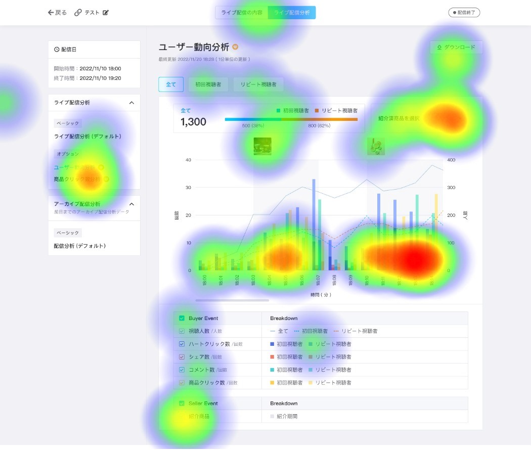
Key Findings ✨
Key Findings ✨
It is necessary to allow users to hover & display the corresponding data in the interactive chart
It is necessary to allow users to hover & display the corresponding data in the interactive chart
Task 5
Task 5
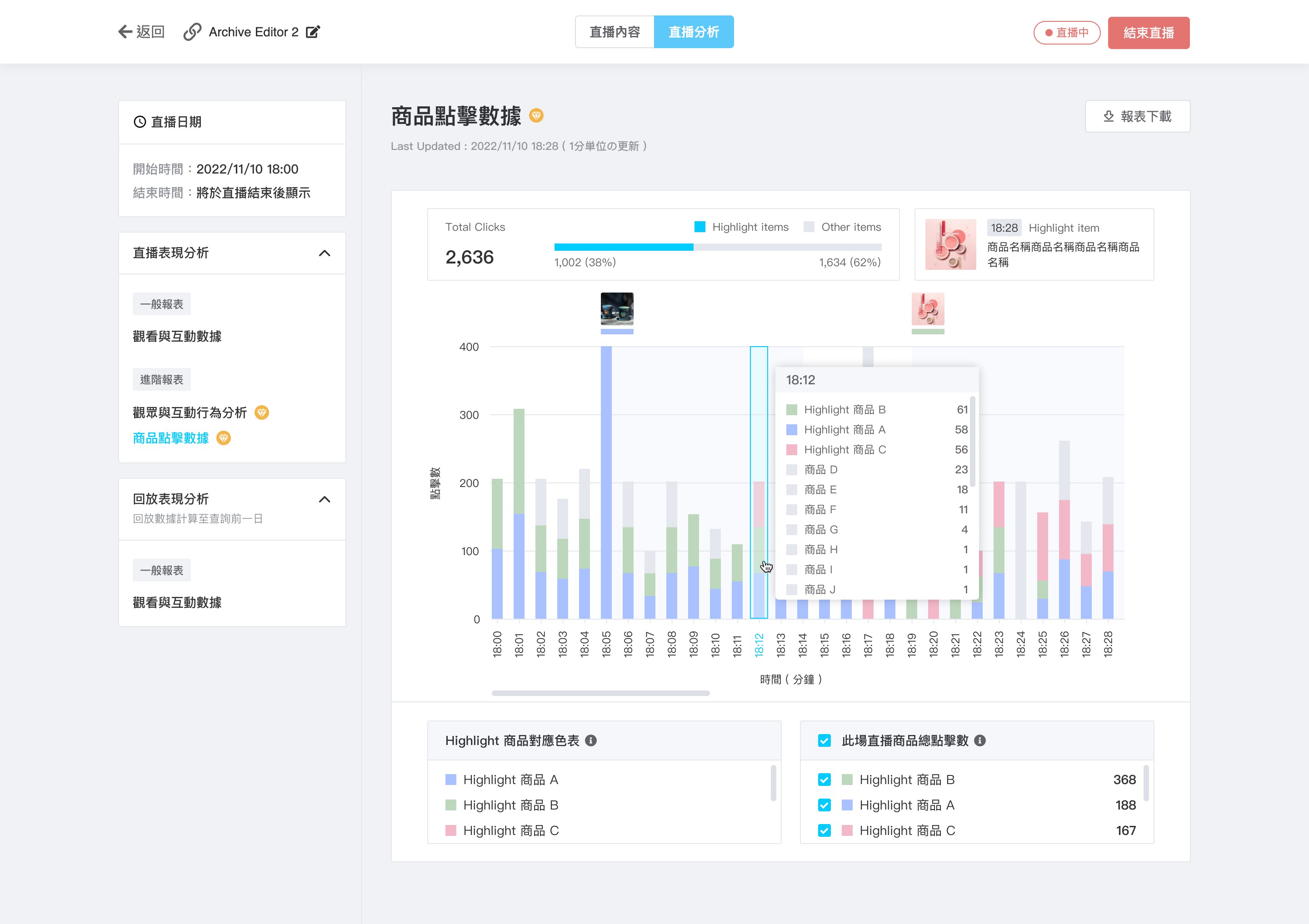
18:12どの「商品クリックされたかとクリック数」を確認したい
18:12どの「商品クリックされたかとクリック数」を確認したい
18:12どの「商品クリックされたかとクリック数」を確認したい
To check which products were clicked on and the number of clicks at 18:12
To check which products were clicked on and the number of clicks at 18:12
To check which products were clicked on and the number of clicks at 18:12
Interactive chart - User control and freedom
Interactive chart - User control and freedom
Interactive chart - User control and freedom
✦ 1 Tester Tap on the chart
✦ 2 Testers Tap between the chart & the time
✦ 3 Testers Tap the time directly
✦ 1 Tester Tap on the chart
✦ 2 Testers Tap between the chart & the time
✦ 3 Testers Tap the time directly
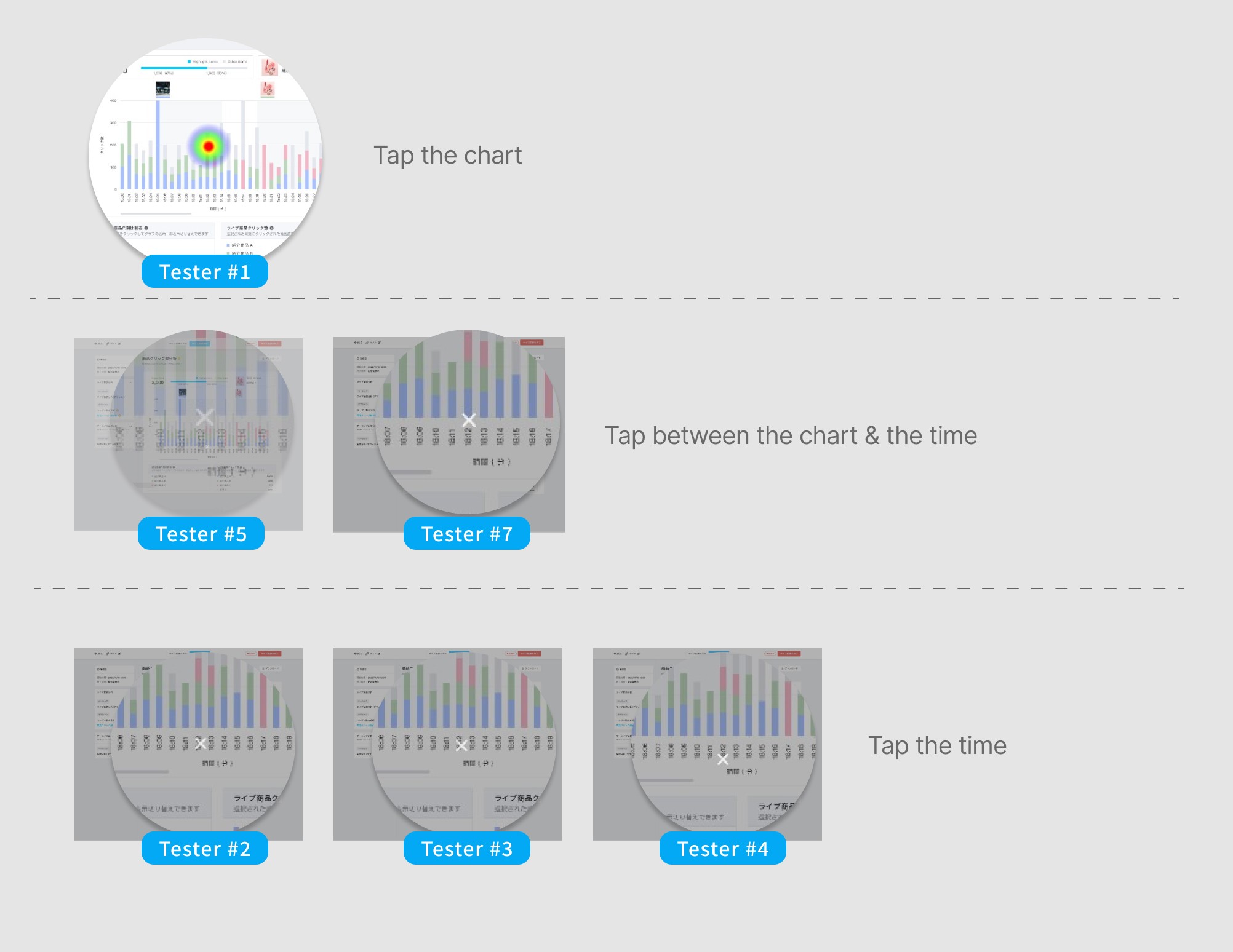
Icing on the cake
Icing on the cake
According to the test result, we added the hover state and tap area from the bar chart to the bottom of the time.
According to the test result, we added the hover state and tap area from the bar chart to the bottom of the time.
Key issues 🥲
Key issues 🥲
Task 6
Task 6
ライブ終了後、「商品C紹介時のみのユーザー動向」データを確認したい
Collect obvious problems in
current feature
ライブ終了後、「商品C紹介時のみのユーザー動向」データを確認したい
ライブ終了後、「商品C紹介時のみのユーザー動向」データを確認したい
After the live stream ends, I want to review the user trends specific to the introduction of product C.
Collect obvious problems in
current feature
After the live stream ends, I want to review the user trends specific to the introduction of product C.
After the live stream ends, I want to review the user trends specific to the introduction of product C.
Drop-down menu- Flexibility and efficiency of use
Collect obvious problems in
current feature
Drop-down menu- Flexibility and efficiency of use
Drop-down menu- Flexibility and efficiency of use
This feature allows users to review live streaming performance and revisit specific highlights after the event ends.
This feature allows users to review live streaming performance and revisit specific highlights after the event ends.
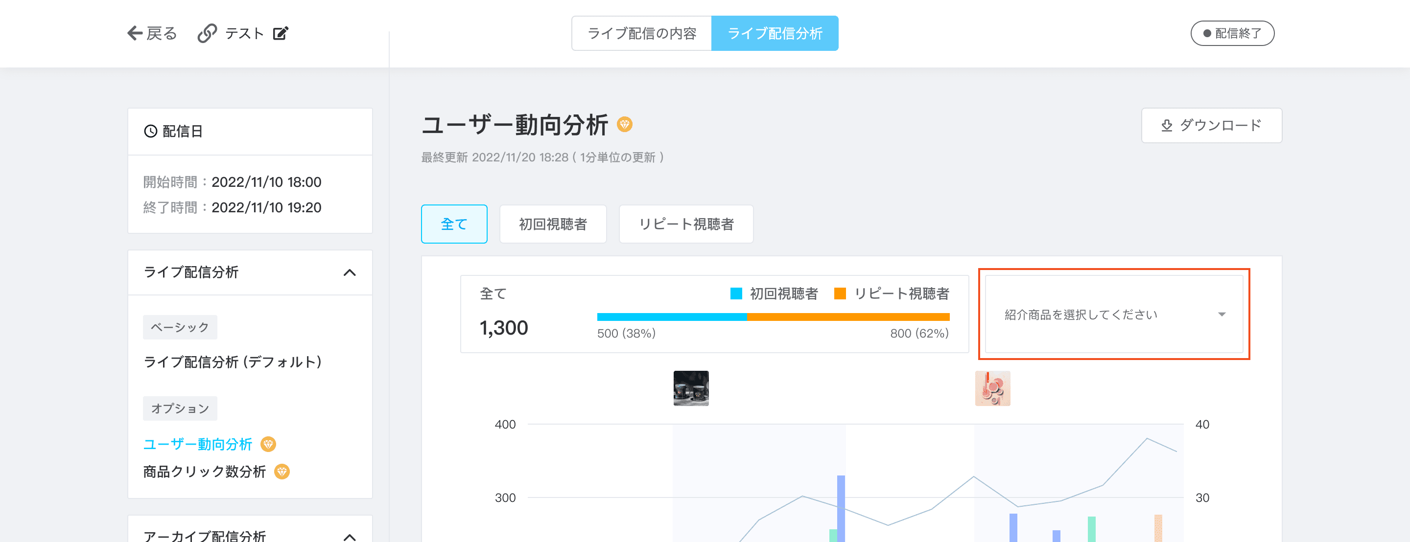
The test result showed that the current design causes confusion due to its default state, leading to clicking errors.
The test result showed that the current design causes confusion due to its default state, leading to clicking errors.
Design Iteration
Design Iteration
Addressed the default styling of the dropdown menu by implementing a corresponding empty state design. This allows users to clearly understand the dropdown menu's functionality even before clicking on it.
Addressed the default styling of the dropdown menu by implementing a corresponding empty state design. This allows users to clearly understand the dropdown menu's functionality even before clicking on it.
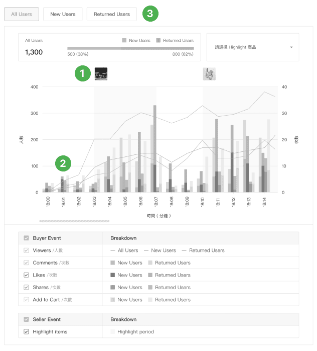
Page Showcase
Page Showcase
Here is the operationalization of the ultimate design, representing the culmination of the design process translated into practical application.
Here is the operationalization of the ultimate design, representing the culmination of the design process translated into practical application.
Impact
Impact
Business Goal
Business Goal
This is a paid feature and 80% of existing users are willing to try it for free, and 50% are willing to switch to paid users after a free trial.
This is a paid feature and 80% of existing users are willing to try it for free, and 50% are willing to switch to paid users after a free trial.
Success Case
Success Case
We assist users in identifying live events where their marketing team haven't distributed reminders to returning customers.
We assist users in identifying live events where their marketing team haven't distributed reminders to returning customers.
Takeaways
Takeaways
By building this product from the idea to execution, I learned three most important things in the process:
By building this product from the idea to execution, I learned three most important things in the process:
1
Prioritize user value
Our delivered product must be meaningful, necessitating a profound understanding of users' true needs and desires.
1
Prioritize user value
Our delivered product must be meaningful, necessitating a profound understanding of users' true needs and desires.
1
Prioritize user value
Our delivered product must be meaningful, necessitating a profound understanding of users' true needs and desires.
2
The user experience shouldn't be sacrificed by MVP
We want to deliver a product faster doesn't necessarily mean we have to compromise user experience to speed up, users can wait for the new features in the next release, but they cannot bear the bad experience.
2
The user experience shouldn't be sacrificed by MVP
We want to deliver a product faster doesn't necessarily mean we have to compromise user experience to speed up, users can wait for the new features in the next release, but they cannot bear the bad experience.
2
The user experience shouldn't be sacrificed by MVP
We want to deliver a product faster doesn't necessarily mean we have to compromise user experience to speed up, users can wait for the new features in the next release, but they cannot bear the bad experience.
3
Address genuine issues
While we may have numerous ideas, it's crucial to validate them rigorously to pinpoint the most effective solution for real problems.
3
Address genuine issues
While we may have numerous ideas, it's crucial to validate them rigorously to pinpoint the most effective solution for real problems.
3
Address genuine issues
While we may have numerous ideas, it's crucial to validate them rigorously to pinpoint the most effective solution for real problems.

Page Showcase
Here is the operationalization of the ultimate design, representing the culmination of the design process translated into practical application.