#SaaS
#in-App web
Live Commerce
Live Commerce
Live Commerce
Live Commerce
Live Commerce
Live Commerce
Introduce live commerce services on 17LIVE to increase the platform's revenue sources and overall revenue.
Introduce live commerce services on 17LIVE to increase the platform's revenue sources and overall revenue.
Introduce live commerce services on 17LIVE to increase the platform's revenue sources and overall revenue.
Introduce live commerce services on 17LIVE to increase the platform's revenue sources and overall revenue.
Introduce live commerce services on 17LIVE to increase the platform's revenue sources and overall revenue.
Introduce live commerce services on 17LIVE to increase the platform's revenue sources and overall revenue.


Apr/2023~June/2023
Timeline
Sr. UX Designer
Role
Apr/2023~June/2023
Timeline
Sr. UX Designer
Role
Background
Background

17LIVE is the parent company of HandsUP, serving as the primary live streaming platform. HandsUP is a live commerce platform providing SaaS services for businesses to swiftly establish e-commerce websites and live streaming for sales. Launched in Taiwan, it expanded to Japan in 2020.
17LIVE is the parent company of HandsUP, serving as the primary live streaming platform. HandsUP is a live commerce platform providing SaaS services for businesses to swiftly establish e-commerce websites and live streaming for sales. Launched in Taiwan, it expanded to Japan in 2020.
Goal
Goal
By integrating HandsUP (JP) live commerce products under 17LIVE company, provide seamless live sales and shopping experiences for 17LIVE users.
Design Scope
Design Scope
Collaborated with 17LIVE designers & Product Managers to ensure consistency across both platforms' experiences.
✦ Buyer Platform: 17LIVE App(Native), HandsUP(in-App web-view)
✦ Merchant Portal (JP): HandsUP
*In this page, I will focus on buyer shopping experience design
Collaborated with 17LIVE designers & Product Managers to ensure consistency across both platforms' experiences.
✦ Buyer Platform: 17LIVE App(Native), HandsUP(in-App web-view)
✦ Merchant Portal (JP): HandsUP
*In this page, I will focus on buyer shopping experience design


User Story Map
Due to the tight schedule, PMs completed the User Story Map and discussed it with the design team. Utilizing this, the design team promptly crafted a Wireframe and User Flow to ensure effective communication within the team.


Purchase User Flow
Purchase User Flow
After discussing the user story map with Product Managers, we took the step of determining a reasonable user flow before delving into design ,and ensuring that users can easily navigate the native app and in-app web-view.
After discussing the user story map with Product Managers, we took the step of determining a reasonable user flow before delving into design ,and ensuring that users can easily navigate the native app and in-app web-view.


Wireflow
Wireflow
The collaborative format for design
The collaborative format for design
This is the first collaboration with 4 designers responsible for different products. Below are design draft examples. We segmented the interface between the 17 APP Native service and the HU webview service into different sections to make it easier for engineers to read.
This is the first collaboration with 4 designers responsible for different products. Below are design draft examples. We segmented the interface between the 17 APP Native service and the HU webview service into different sections to make it easier for engineers to read.


Keyframe
Keyframe
After scoping out the features we would like to deliver for the first launch, I started working on the design and address the interaction detail.
Due to resource constraints, the Modal framework is managed by the APP, while the following content is handled by the HandsUP Web team. Therefore, ensuring consistent operation behavior and user experience with the APP is a major challenge for this project.


Challenges & Solutions
Challenges & Solutions
Before delving into UI design and creating page layouts, we collaborated with PMs, engineers, and designers, facing challenges related to experience consistency and development processes.
Before delving into UI design and creating page layouts, we collaborated with PMs, engineers, and designers, facing challenges related to experience consistency and development processes.
Challenge
Should the UI style follow 17LIVE or HandsUP?
Should the UI style follow 17LIVE or HandsUP?


Solution
Followed 17LIVE Design System
Followed 17LIVE Design System
While HandsUP provides e-commerce services, the entire user scenario takes place within 17LIVE. Therefore, we have decided to utilize the 17LIVE Design System to prevent user confusion.
While HandsUP provides e-commerce services, the entire user scenario takes place within 17LIVE. Therefore, we have decided to utilize the 17LIVE Design System to prevent user confusion.


Challenge
The Entrance
The Entrance
Due to the presence of multiple activity stickers and functional statuses in the live room, the shopping feature serves as the main focus of the sales broadcast. Therefore, the button should be placed prominently.
Due to the presence of multiple activity stickers and functional statuses in the live room, the shopping feature serves as the main focus of the sales broadcast. Therefore, the button should be placed prominently.


Solution
Based on our competitive review, we discovered that the comment section was the most interactive area to locate ''Shop Entrance".
Based on our competitive review, we discovered that the comment section was the most interactive area to locate ''Shop Entrance".


Challenge
Navigation of in-app web-view
Navigation of in-app web-view
The challenges of navigation within an in-app web-view include ensuring seamless integration with the app's native navigation.
The challenges of navigation within an in-app web-view include ensuring seamless integration with the app's native navigation.


Why did we not consider customized browser in MVP?
Why did we not consider customized browser in MVP?
In the limited modal page, we believe that retaining only the "Back" function is essential for basic navigation. This allows users to return to their recently visited pages, streamlining the interface and reducing user confusion and cognitive load.
Furthermore, the modal can offer gestures, allowing users to minimize the product list's screen real estate without compromising viewing quality.


Solution
Only retaining the "Back" & Close function
Only retaining the "Back" & Close function
Due to limited development resources, and after taking stock of the strengths and weaknesses of user experience, we have discovered:
In the MVP stage, retaining the "Back" function within the in-app web-view is crucial for basic navigation, ensuring users can navigate back to the previous screen. Simultaneously, retaining the "Close" function in the webview modal framework signifies users' engagement in a dedicated shopping process and provides an option to exit the flow.


Simultaneously, retaining the "Close" function in the webview modal framework signifies users' engagement in a dedicated shopping process and provides an option to exit the flow.
Simultaneously, retaining the "Close" function in the webview modal framework signifies users' engagement in a dedicated shopping process and provides an option to exit the flow.


Challenge
List view or Card view?
List view or Card view?


Solution
List view
List view
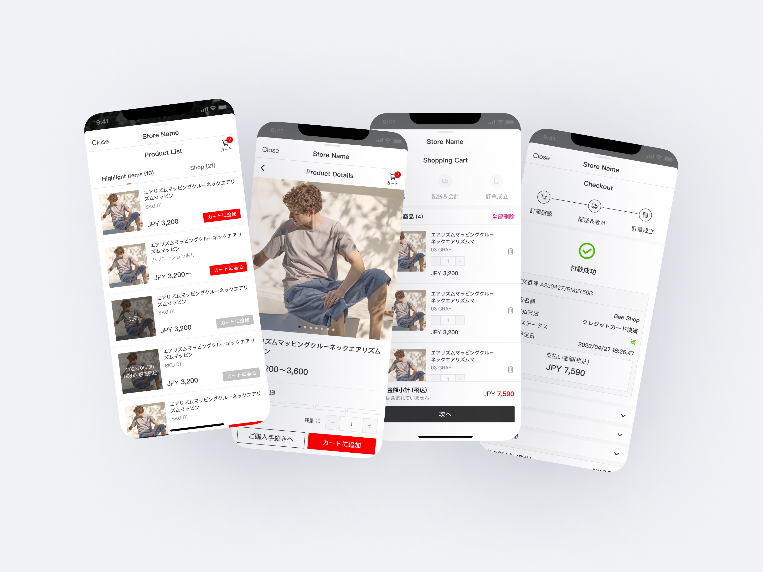
List view presents items in a vertical list, aiding quick browsing and comparison due to its concise format. Conversely, card view may display fewer products in limited screen space due to its larger item cards.
List view presents items in a vertical list, aiding quick browsing and comparison due to its concise format. Conversely, card view may display fewer products in limited screen space due to its larger item cards.
Challenge
How to address another layer of popup on the modal?
How to address another layer of popup on the modal?
Solution
Define the usage scenario of Bottom modal & Popup & Alert
Define the usage scenario of Bottom modal & Popup & Alert
✦ Bottom Modal: Typically used to display additional options or information relevant to the current task or content.
✦ Bottom Modal: Typically used to display additional options or information relevant to the current task or content.
✦ Popup: Used to present temporary information on the current page.
✦ Popup: Used to present temporary information on the current page.
✦ Alert: Used to show users important notices, warnings, or error messages that require immediate attention and response.
✦ Alert: Used to show users important notices, warnings, or error messages that require immediate attention and response.


Outcome
Outcome
In the third quarter of 2023, we launched our MVP and successfully onboarded merchants, obtaining successful sales cases.
In the third quarter of 2023, we launched our MVP and successfully onboarded merchants, obtaining successful sales cases.


Next Iteration
Next Iteration
During the MVP stage, we maintained the essential user experience. During a project sprint gap, I discussed with other designers our iteration goals. We aimed to primarily enhance conversion rates. Consequently, we selected two optimization tasks related to buyers from the Design Backlog.
During the MVP stage, we maintained the essential user experience. During a project sprint gap, I discussed with other designers our iteration goals. We aimed to primarily enhance conversion rates. Consequently, we selected two optimization tasks related to buyers from the Design Backlog.
1
The items in the shopping cart can be linked to their respective product detail pages.
Associating products with their detail pages enhances the shopping experience by allowing users to easily access more item details and be reminded of them. Additionally, it ensures that the clickable area does not interfere with selecting multiple input buttons.


2
Convenience store payment with a card-style layout that includes record information.
Assisting users in remembering previously filled information can shorten the time spent on filling out checkout details, thereby increasing the purchase conversion rate.
2
Convenience store payment with a card-style layout that includes record information.
Assisting users in remembering previously filled information can shorten the time spent on filling out checkout details, thereby increasing the purchase conversion rate.
2
Convenience store payment with a card-style layout that includes record information.
Assisting users in remembering previously filled information can shorten the time spent on filling out checkout details, thereby increasing the purchase conversion rate.


More projects


